Blog Designing Accessible Ticket Books for Visually Impaired Event Attendees
Ticket books are accessible to visually impaired users when they include braille, large-font type, and tactile features that provide the core information needed to use the ticket. Ensuring you are offering accessible ticket options is a crucial way to promote inclusivity and equity at your event and ensure the comfort of all attendees.
Today, many event organisers lean towards purely digital ticket options; however, for those who are visually impaired, these can be of little use. Promoting accessible design features and offering physical ticket options with braille printing, large-font tickets, or tactile enhancements to help with readability helps those with a visual impairment to understand all the key information they need to attend and enjoy the event.
Producing accessible tickets is a process that requires significant consideration and thought. To help you out, we have broken down all the key information you need, such as the important design features to include, so that your next event is as inclusive as possible.

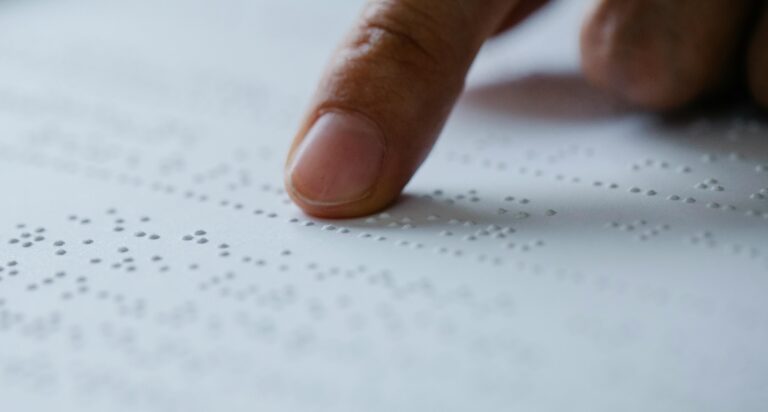
For those who are visually impaired, incorporating braille into ticket designs can be a game-changer for accessibility. Additionally, under the Disability Discrimination Act 1992, every individual with a disability has the right to access goods and services that all other members of society have access to, which highlights the importance of braille and other tactile markers on event tickets. However, in order to pull it off correctly, several considerations need to be taken into account.
For ticket designs, braille must typically adhere to the Unified English Braille system. This is the standardised system across most English-speaking countries, and the one that visually impaired people are likely to know and understand.
In order to have the best effect, braille must be placed in an easily accessible area of the ticket; most often, this is the back or bottom edge. However, be careful that it does not interfere with the printed text, as you want the ticket to be functional for all.
Accessibility-friendly tickets are usually made from durable and heavy materials to ensure the braille embossing is as effective as possible. In order to be readable, the embossing must be crisp, which is why this is such an important consideration.
We recommend cardstock or plastic, as this works best with common embossing techniques such as dot matrix and laser engraving to create the raised dots.

In order to maximise the accessibility of a ticket, it is a good idea to include other tactile enhancements that extend beyond braille. These enhancements improve the usability of the ticket and ensure a seamless experience.
Some enhancement features you could consider including on your tickets are;
Overall, adding these tactile features helps users to quickly orient themselves and navigate a ticket book. Textured surfaces are therefore extremely important for event ticketing, as they ensure inclusivity and accessibility for all users.
Additionally, they align with universal design principles by providing accessible options for those with disabilities, which is an important consideration for any event.
In addition to adding features for the visually impaired, it is also important to consider those who have low vision, i.e., people who have limited use of their eyesight. The best solution here is large-font ticketing, which provides an accessible and readable option.
When considering the best practices for large font ticketing, the first factor to think about should always be font size. The minimum recommended font size for printed accessibility is typically between 18-24 points; however, this can vary depending on the font type.
The best fonts to use in this situation are typically sans-serif fonts such as Arial or Helvetica. This is because they have clear, defined lettering and sufficient spacing, making them easier to read for low-vision individuals.
Additionally, to maximise your use of font, it is important to consider the contrast between the text and the background. Low contrast leads to less readability, so your background must allow the text to stand out. For example, if you are using black text, a white background is the best choice.
Furthermore, ensuring visual consistency in your formatting will enhance readability further. How you format the ticket can drastically impact its readability, so make sure you are incorporating formatting techniques that enhance fast reading for low-vision attendees, such as bold headings, ample spacing, and grouping related information together.
Designing tickets for blind and low-vision attendees requires another crucial consideration, namely, the materials and printing methods used to create the tickets. These have a significant effect on the readability of the ticket, so it is important you get it right.
Printing starts with the paper you use, and if you are printing tickets with textured elements such as braille, the paper you choose should be thick and rigid. The best choice is typically heavy cardstock, as it supports embossing and retains braille readability.
Considerable thought should also be put into your ink choice, as certain inks or finishes can reduce visual accessibility. Dark, matte inks, such as navy or black, are the best option, provided they are printed on a light background. Additionally, you should steer clear of glossy finishes, as while they look great, the glare they produce can reduce readability.
When it comes to printing your tickets, it is important that you use high-quality embossing techniques such as dot matrix embossing or laser engraving. These methods produce the best results and ensure that the tactile features on the tickets are long-lasting and survive the printing process.
While the above considerations can seem overwhelming, taking your time with the design and printing process is crucial, as it reduces the chances of making a mistake in the printing that reduces the readability. Common mistakes include over-embossing, low contrast between ink and background, and printing on paper that is too soft to handle textured elements, so keep this in mind when you are designing your tickets.
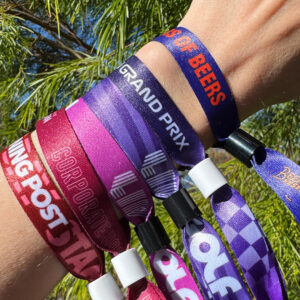
By using branding on lanyards and Tyvek wristbands used on open days, sponsors gain broad visibility and reach a large and diverse audience base. This persistent exposure reinforces their brand message and can be a powerful incentive for building long-term brand loyalty.
When designing tickets, a great strategy to implement that improves the experience for all users of your final product is to keep the universal design principles. In the context of ticketing and physical ticket books, these principles are;
These principles are crucial when it comes to improving accessibility for all users, as they allow a designer to take into account every need and requirement a user might have. This ensures that all users, whether they are able-bodied or have a disability, can use the ticket books in the same manner and have no trouble when it comes to usability.
It is highly recommended that you consider the universal principles and accessibility features early in the design process, as it increases your efficiency by ensuring you will not have to double back later and make last-minute changes.
By considering accessibility from the start, you can almost guarantee that all users of your tickets and ticket books will have no issue with your product.
Not only is this the most equitable practice, but it fits into the wider scheme of inclusive event planning, as it means a core component of your event (the ticketing) has sufficiently provided for the needs of all attendees.
We can learn a lot from the experiences of others, which is why it is always a good idea to look at other events that have prioritised accessible ticketing. However, it appears that, sadly, printing tickets with accessible features is not common practice for large-scale events.
The prime example where accessibility features can be made available is during the Coachella Valley Music & Arts Festival, which offers closed captioning, braille or large-font print, and guided tours or other communication‐accessible formats upon request. Attendees are asked to submit requests well in advance (at least 30 days) so that Coachella can arrange the necessary materials and support. This kind of proactive accommodation demonstrates how events can make accessible designs part of operations rather than an after-thought.


Inclusive tickets and ticket books are so much more than a practical tool, as they are a clear act of inclusion and equity. By considering inclusive design principles and offering accessible tickets, event organisers ensure that all attendees can gain the most out of the experience, and don’t need to worry about their disability holding them back.
However, creating accessible tickets is a delicate process with very little room for error, which is why it is so important that you partner with an experienced provider who can help you to prioritise accessibility in the right way.
If you want to provide accessible tickets for your next event, The Wristband Co. can help. Our designs can include custom braille, large font, and tactile ticket books that meet real-world accessibility needs and inclusive design standards. Feel free to reach out to our friendly team by phone at 08 8363 4850 or by email at [email protected].